_4x.png)

Type is Foundational
Type is one of the foundation blocks of communication and graphic design. Because of this, I like to explore many possibilities for the type of each project. Here are some examples of my explorations.
The Met:
Vintage Fashion
I created these flyers for an exhibit at The Met called Vintage Fashion: The Victorian Era Through the Deco Era. I did several explorations for this flyer specifically focusing on playing with type, layout and color before deciding on my final version. The challenge was coming up with something that is both eye catching and legible.


Mud Ceramics
For Mud Ceramics, I wanted to create a unique poster to showcase their mission to share their knowledge of ceramics with the world. To do this, I threw and trimmed four mugs on the wheel and arranged them to spell out the word ‘mud’ as a nod to their logo. I then photographed the setup and edited the image in Photoshop. The result was a visually stunning poster that highlighted the company’s mission in a unique way.
Inspiration

Logo

Drafts
 |  |
|---|---|
 |  |
 |  |
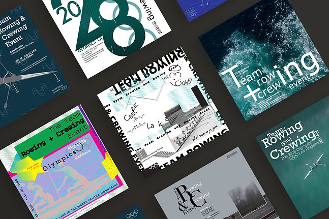
Team Rowing and Crewing Event
The 2028 Olympics:
While experimenting with different designs I sometimes like to try to emulate other designers' styles. This can be a good way to push past a block and open myself up to new possibilities. For these explorations, I tried a designs inspired by David Carson and April Greiman, two graphic design legends. It was a fun challenge to try to create something in their styles. I ended up using a different design since I thought it culminated with a nice logo that could be applied to other events and was a bit more clear but I definitely want to experiment more with other designers styles and see how I can make them my own.

