_4x.png)

Brothers on the Rise Re-branded
Date:
Mar - Aug 2023
Project Type:
Branding | Web Design | Business Papers
The Question
How do you make a fresh and friendly brand for a non-profit focused on helping boys in underserved Oakland neighborhoods develop into compassionate, resilient, and successful men?


The Answer
A balancing act between soft and masculine, fun and serious, youthful and mature. Bold colors, simple shapes, and clean design.

The Process
Three words: Sketches, sketches, sketches. I drew soooo many variation for this logotype playing off the ideas of rising, flying, supporting each other and brotherhood. I was hesitant to use a cursive font at first but in the end it added a nice softness that reflects their mission to imbue the men of tomorrow with empathy and caring. Goodbye toxic masculinity!


Application
A new logo is great but what's the point if you don't put it on something!


Business Papers
I designed new set of business papers for Brothers on the Rise to help them promote their mission. This set includes business cards, paper stock, and envelopes. I played with scale and placement to create engaging designs for simple everyday paper products. I especially enjoyed working on the envelop because of the concept behind it: the word "brothers" literally rises to join the rest of the logo when you open the envelope.
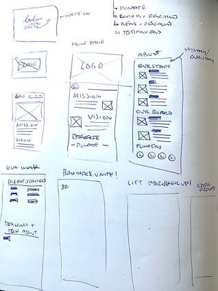

Website Redesign
Using Adobe XD I redesigned the website after creating the branding guide. The website before was utilitarian but not very engaging. By building a more dynamic layout and including brighter colors, I created a more fun design that reflects the mission of Brothers on the Rise. Above are some sketches I did and the website design in Adobe XD. I used my motion design skills to create an opening animation for the page. The video below gives a walk through of the site before and after the redesign. You can also click the button below to explore the new site yourself! It's not actually up and running but Adobe XD simulates what it would be like to navigate the site.